
University Settlement
Our team performed an audit on the 125 year-old NGO’s website to improve access to their life-changing services.
For NEW INC’s Create & Advocate, a hackathon run by the New Museum’s tech incubator.

PROBLEM
Baba Israel and Alison Fleminger from University Settlement described how their website was disorganized, unattractive, and ineffective for the two main groups of users visiting the site: recipients of the Settlement’s services and prospective donors.
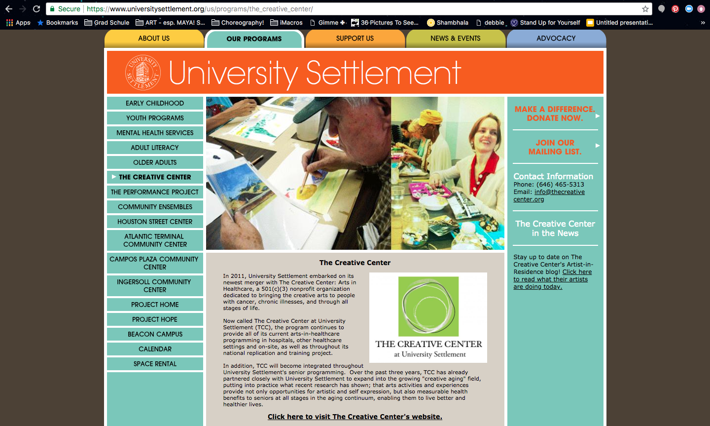
University Settlement website ‘Our Programs’ page. The clients were concerned that the site had too many links, outdated content, and was confusing for their target users: recipients of the Settlement’s services and prospective donors.
Team
SMITA SEN | UX/UI DESIGN LEAD
SABRINA CHIN | UI DESIGNER
JASON CHEW | CONTENT COORDINATOR
FRANCIS TSENG | FRONT-END DEVELOPER
As design Lead, I worked with the team to identify key design problems; to map out our audit and design strategy; to lead information architecture restructuring and prototype design; and to create the visual language for the website.
SOLUTION

Landing Page design for University Settlement website.
With this problem in mind, the team performed an audit of the website. We restructured the sitemap and information architecture, ultimately designing user flows that optimized usability and interfaces that were accessible to the diverse users of the website, especially the elderly, differently abled, and those with limited literacy skills.
PROCESS
When working with the client to restructure the site's content, especially the support programs offered to low-income and immigrant families, we found that most services were organized by age.
Accordingly, we found that a timeline is an intuitive navigation tool and could guide an effective content organization strategy.
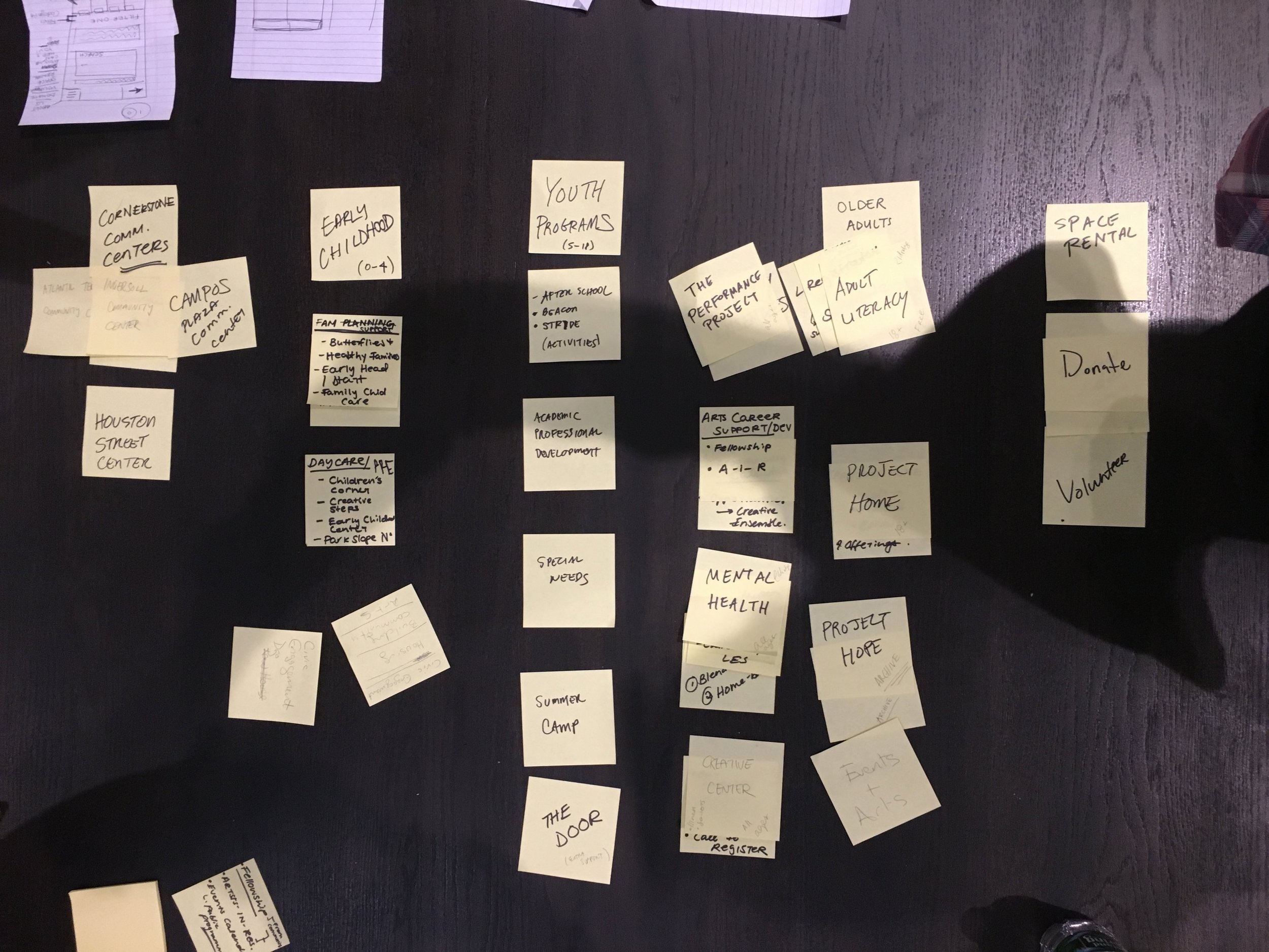

Above: Restructuring the sitemap using post-its. We combed through a sitemap with 40+ paths, dead links, and confusing user pathways to come up with a more effective content organization tool:
a timeline (left).

Playful UI Elements
Playful UI elements, like the above heart as a hover, establish a welcoming and friendly interface while reinforcing one of the NGO's key objectives: to support and to serve low-income and minority communities. These UI details have been key to a positive overall user experience and brand experience.

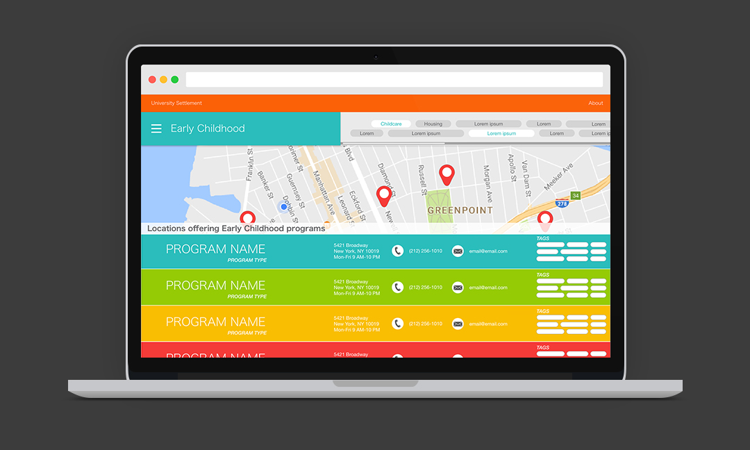
SELECT SERVICES AND LOCATION
The page is laid out so that it is easy to use across desktop, tablet, and mobile platforms. Large touch targets and images enhance accessibility for mobile and tablet use. Users can toggle the types of services they are looking for (Childcare, Housing, After School Programs, et. al.). Most notably, this content organization allows users not only to establish search terms, but also to discover other University Settlement services that may benefit them. This was one of the client's key goals since they felt that their user base isn't aware of how many different kinds of support the organization could offer.
“Large touch targets and images enhance accessibility for mobile and tablet use. ”
SEARCH RESULTS
Search results page. In the toolbar, the dropdown menu (left) is laid beside Services buttons (right). This way, users can toggle their search preferences without having to go back a step.

PROGRAM PROFILE
When a user clicks on a program listing, the Program Profile page appears. The hero area allows for media content. The static left panel contains all location contact details and hours of operation. Tags allow for users to quickly scan the services offered by the program. A card of content offers program managers a space to update details about the services provided as well as a space to highlight recent achievements.
The opportunity to highlight achievements is especially important because the Program Profile page serves two key functions. First, it serves as an informational platform for recipients of services to learn about the program. Second, it serves as a platform for program leaders to showcase their work to donors, national boards, and international juries.
“The Program Profile page serves two key functions: as an information source for users looking for help, and as a platform for program leaders to showcase their work to donors and national boards.”

““Similarly, representatives from University Settlement, who came to Create and Advocate with hopes of redesigning a website that would serve its users in a more holistic and engaging way, were impressed with the effectiveness of the team structure... By the end of the weekend, her team had a full design structure for a new website marked by a clean and engaging visual language.””
NOTE: The Landing Page, Timeline, Search Results, and Program Profile were all designed during the course of Create & Advocate. After Create & Advocate, I went back and redesigned the Select Services Page to create the page that is shown above, and added the toggle search preferences feature to the Search Results page.